UNIVERSITY OF SYDNEY
PROJECT OVERVIEW
The University of Sydney commissioned a mobile event booking prototype that would streamline campus-wide event discovery and ticketing. Designed the app entirely in Figma, introducing a Tinder-like swipe mechanism for students to add events to their cart and complete quick checkouts. The design incorporated brand colors and a strong social element, users could see who else was attending and invite friends. Built for a student audience, the app is a fusion of playful interaction, personalized discovery, and event networking.
CLIENT
UNIVERSITY OF SYDNEY
Year
2023
Services
Product Design
Build
FIGMA
DESIGN
CHALLENGES
Designing a swipe-based booking system posed challenges in maintaining intuitive usability while introducing a novel gesture format for event discovery. The app also required clear visual hierarchies to handle diverse types of events and support rapid decision-making. Another challenge was balancing simplicity with interactivity—providing engaging social features like "see who’s going" and the ability to invite peers, without cluttering the interface or creating unnecessary complexity in the user flow.
ASPIRATIONS
Deliver a mobile-first solution that simplifies event discovery and booking for university students in a way that feels familiar, playful, and fast.
ASPIRATIONS
Deliver a mobile-first solution that simplifies event discovery and booking for university students in a way that feels familiar, playful, and fast.
Design and Prototyping
Build a sense of student community around campus events, increase participation rates, and create a platform capable of scaling to include more personalized or academic event filtering in the future.
GUIDING PRINCIPLES
The app design followed a set of functional and psychological principles tailored to student behavior and campus culture:
Provide fast access to relevant event information with minimal cognitive load
Use social momentum (peer visibility and invites) to increase engagement
Ensure all flows feel modern, playful, and consistent with Gen Z mobile app expectations
Maintain brand fidelity by using official university colors, typefaces, and visual standards


ACTIVITIES
Design and Prototyping
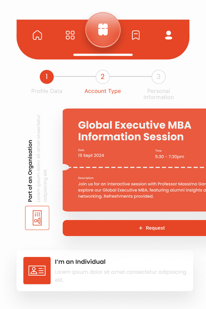
The app was designed in Figma as a high-fidelity prototype. Key screens included:
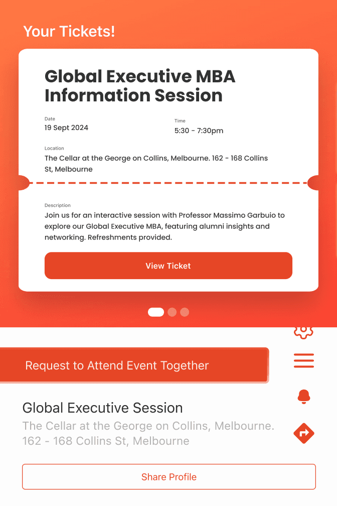
A Tinder-style card stack for browsing events
A cart interface with visual confirmations and ticket summaries
A calendar view to explore events by date
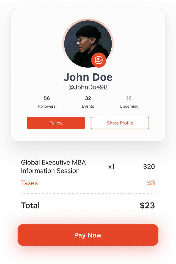
A people-view module to see attendees and invite friends
Each interaction was optimized for mobile and featured consistent use of the university’s color palette and typography.
Research and Planning
An analysis of student engagement patterns and competing event platforms informed early design decisions. Inspiration was drawn from social apps like Tinder and Bumble to create a user-friendly, swipeable experience.
OUTCOMES
The prototype successfully demonstrated a fresh approach to campus event engagement by merging swipe-based discovery with social features and visual clarity. The app presented a scalable solution for managing diverse university events, with a structure built for easy extension into user analytics, and real-time updates. By tapping into psychological design principles such as the Zeigarnik Effect and social validation, the experience encouraged repeat interaction and peer-driven attendance. The final design balanced playfulness with institutional trust, creating a platform well-aligned with student behavior and university goals.